Nail salon logo design is where your brand starts, but it is also where many salons go wrong. A logo with a delicate script font, a tiny polish bottle and three colors may look lovely on a large screen, then turn into an unreadable smudge on a business card, a gift certificate or the round profile photo on Google and Instagram. A strong salon logo is simple, readable at small sizes, distinctive in your neighborhood and ready for every place clients will see it.
This guide walks through how to design a nail salon logo that works: the main logo types, how your salon name shapes the design, choosing colors and fonts, avoiding common clichés, testing at small sizes, checking trademarks, the files you should receive and the places your logo must work, from the storefront sign to the favicon on your website.
In this article
- What a good nail salon logo does
- The main logo types
- Start with your name
- Choosing colors
- Choosing fonts
- Look at your competitors first
- Avoid the most common clichés
- Test at small sizes
- Check trademarks before you commit
- Files you should receive
- Where your logo must work
- A simple brand guide
- Working with a designer
- Refreshing an old logo
- Logos for different salon styles
- How a logo shows up in print
- Signs and storefronts
- Social media and Google profile images
- Beyond the mark: the rest of your brand
- Naming and visual identity for a second location
- Names in two languages
- Budget and timeline
- Questions to ask a designer
- Keep the brand consistent
- A launch plan for a new look
- Mistakes to avoid
- How Dreamer helps with nail salon logos
- Frequently asked questions
What a good nail salon logo does
- Identifies you instantly on a sign, a card or a phone screen.
- Stays readable at small sizes and from across the street.
- Works in one color, for stamps, embroidery and window decals.
- Fits your style, whether luxurious, playful, natural or modern.
- Stands apart from the other salons nearby.
The main logo types
| Type | What it is | Works well when |
|---|---|---|
| Wordmark | The salon name in a distinctive font | The name is short and memorable |
| Lettermark or monogram | Initials, often in a shape | The name is long or you want a compact symbol |
| Symbol plus wordmark | An icon next to or above the name | You want a stand-alone icon for social media |
| Emblem | Name and icon inside a badge | A classic or vintage style |
Most salons benefit from a main logo plus a compact version: initials or the icon alone for profile photos, favicons and small stickers.
Start with your name
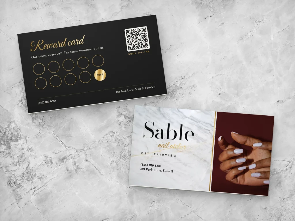
The name shapes the logo. Short names fit bold wordmarks; long names may need a monogram for small uses. Before designing, check that the name is easy to read and spell, does not copy a competitor nearby and is available as a domain and social media handle. Our Vietnamese guide to choosing a nail salon name covers naming in detail.
Choosing colors
- Limit the palette to one or two main colors plus a neutral.
- Think about where it will appear: white walls, black signs, pink storefronts, kraft paper bags.
- Check contrast so the logo stays readable on light and dark backgrounds.
- Avoid trends that date quickly, such as heavy gradients or neon effects that print poorly.
- Prepare a one-color version for stamps, foil, embroidery and decals.
Colors carry feeling: soft blush and cream feel gentle and calm; black and gold feel luxurious; bright pink and yellow feel playful. Choose what matches your salon, not what is popular this year.
Choosing fonts
Fonts give the logo its voice:
- Script fonts feel elegant but become unreadable when too thin or ornate. If you use one, choose a clear script and test it small.
- Serif fonts feel classic and refined.
- Sans-serif fonts feel modern and clean.
- Pair carefully: one character font for the name and one simple font for a tagline, at most.
Never stretch or squeeze letters to fit a space; choose a font that fits naturally.
Look at your competitors first
Before sketching anything, collect the names and visuals of the ten salons closest to you: their signs, Google photos and Instagram profiles. Note the colors and styles they use most. If every salon on your street uses pink script and a polish bottle, a clean navy wordmark will stand out immediately; if everyone is minimal and black, warmth and color may be your advantage. Being different from your neighbors matters more than following industry habits, because clients compare the salons they can see on the same map screen.
Avoid the most common clichés
Many nail salon logos use the same images: a polish bottle, a hand with long nails, a lotus flower, a woman's profile with flowing hair. Clichés make a logo forgettable and can look like dozens of others in the same city. If you use a symbol, look for something tied to your salon's story, name or neighborhood, and simplify it to a few clean shapes.
Test at small sizes
Before approving a logo, test it:
- At the size of a business card logo.
- As a circle profile picture on Instagram and Google.
- As a website favicon in a browser tab.
- In black and white.
- On a phone screen at arm's length.
If you cannot read the name or recognize the shape, simplify.
Check trademarks before you commit
A logo and name that conflict with an existing brand can force a costly change later. Search the U.S. Patent and Trademark Office's trademark database for similar names and marks in beauty services, and search Google and social media for salons with the same or similar names nearby. For important brands, talk to a trademark attorney about registration.
Files you should receive
When a logo is finished, ask for:
- Vector files (SVG, AI, EPS or PDF) for signs, printing and embroidery.
- PNG files with transparent backgrounds in several sizes for the web and social media.
- Full-color, one-color black and one-color white versions.
- Horizontal and stacked layouts if you have both.
- The compact icon or monogram on its own.
- Color codes (CMYK for print, RGB or HEX for screens) and the font names.
Store the files in a shared folder you control, so any printer or designer can use them later. Keep a backup copy in a second place, such as cloud storage and a USB drive, because a lost file often means paying to recreate artwork that already existed.
Where your logo must work
- Storefront sign and window graphics.
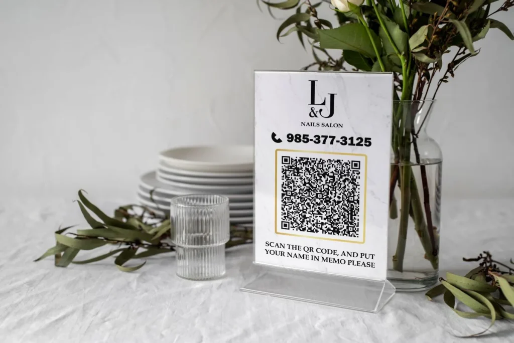
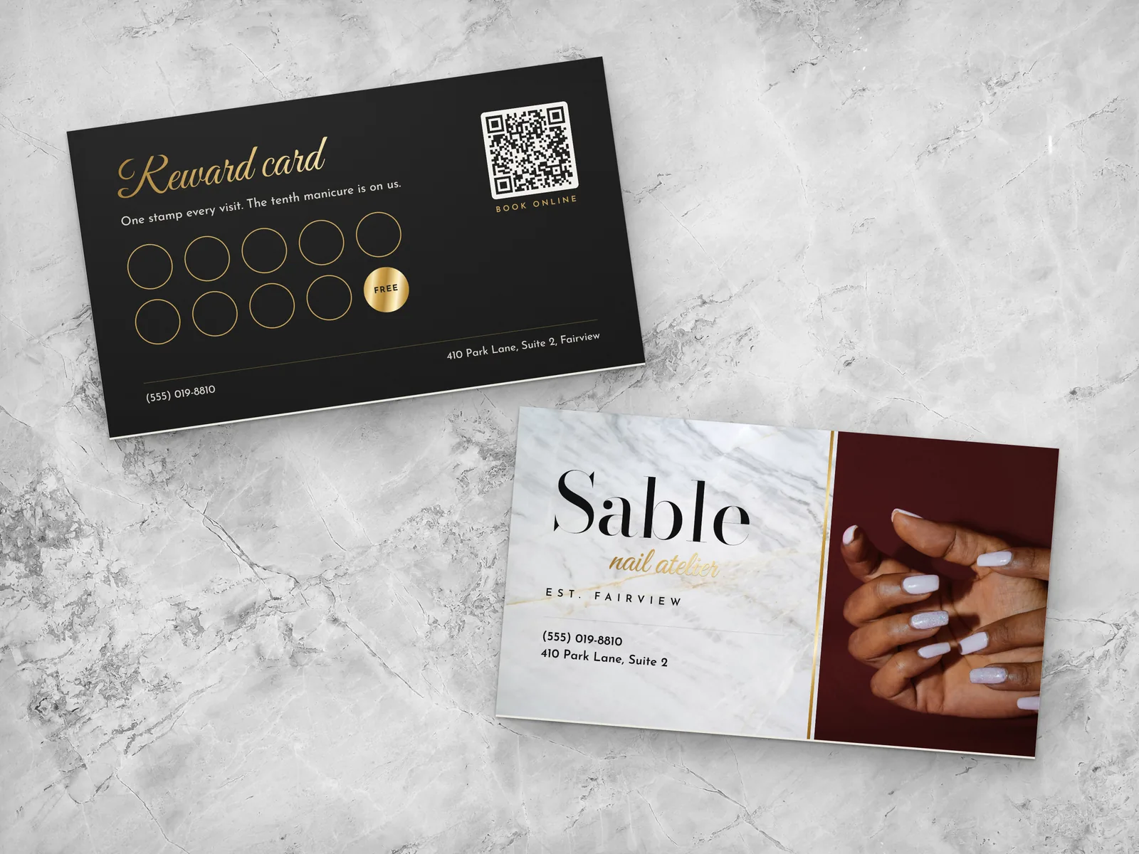
- Business cards, appointment cards and gift certificates.
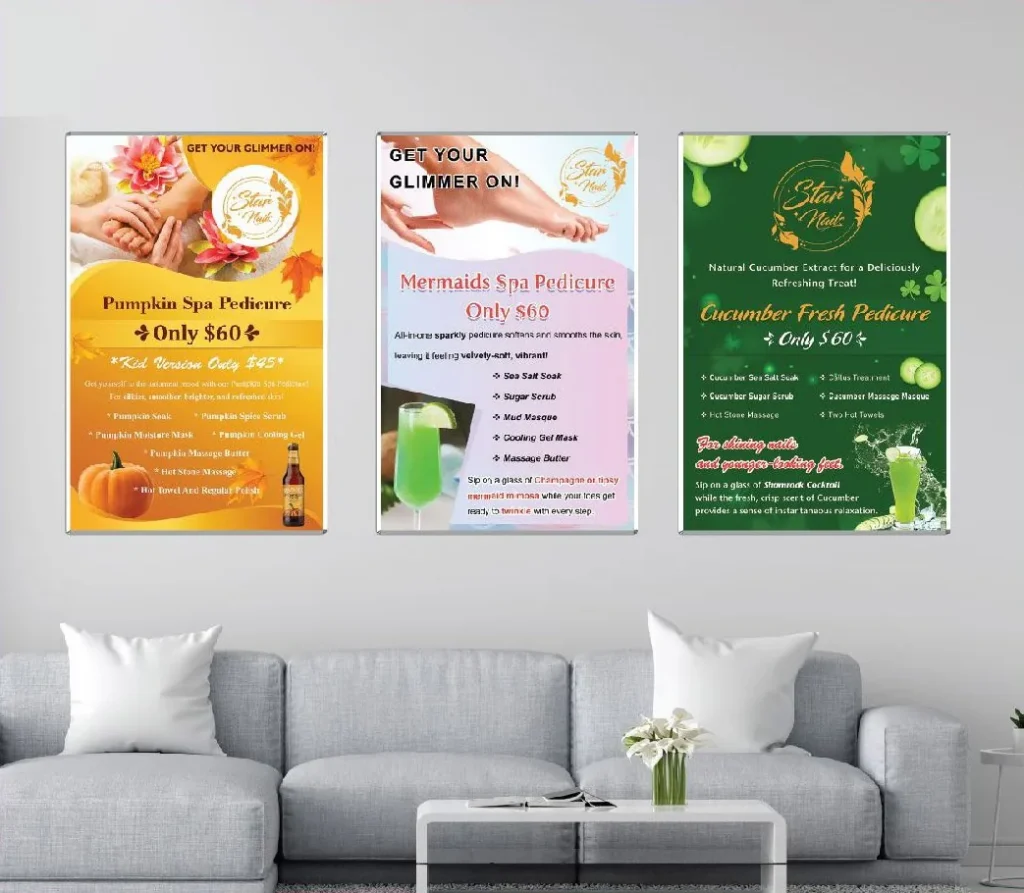
- Price menus and wall menus.
- Website header and favicon.
- Google Business Profile and social media avatars.
- Uniforms, aprons and name tags.
- Bags, stickers and packaging.
- Email signatures and booking confirmations.
Design for the hardest uses first, such as tiny icons and one-color printing, and the logo will work everywhere else too.
A simple brand guide
Even a small salon benefits from a one-page brand guide: the logo versions, colors with their codes, fonts, how much space to leave around the logo and examples of correct and incorrect use. It keeps every printed piece, post and sign consistent, even when different people create them.
Working with a designer
- Write a short brief: your name, style, clients, colors you like and dislike, competitors nearby.
- Share examples of logos you like and explain why.
- Review a few concepts, not dozens.
- Test the favorite on a card, a sign mockup and a phone screen.
- Refine the chosen direction.
- Receive all final files and the brand guide.
Refreshing an old logo
If your salon has an old logo that looks dated or prints poorly, a refresh can modernize it while keeping what clients recognize: similar colors, a cleaner font, a simplified icon. Roll out the new logo everywhere at once, including your Google profile, so clients are not confused.
Logos for different salon styles
- Luxury nail spa: a refined serif or elegant script with plenty of space, black and gold or deep jewel tones, a monogram for small uses.
- Family neighborhood salon: friendly rounded fonts, warm colors, a simple icon that feels welcoming.
- Trendy nail bar: bold type, bright colors, playful shapes, a strong icon for social media.
- Minimal studio: a clean wordmark in one color, lots of white space, no icon at all.
- Natural or organic salon: earthy colors, simple botanical shapes, matte finishes on print.
Choose the direction that matches your interior and clients, so the logo feels like walking through your door.
How a logo shows up in print
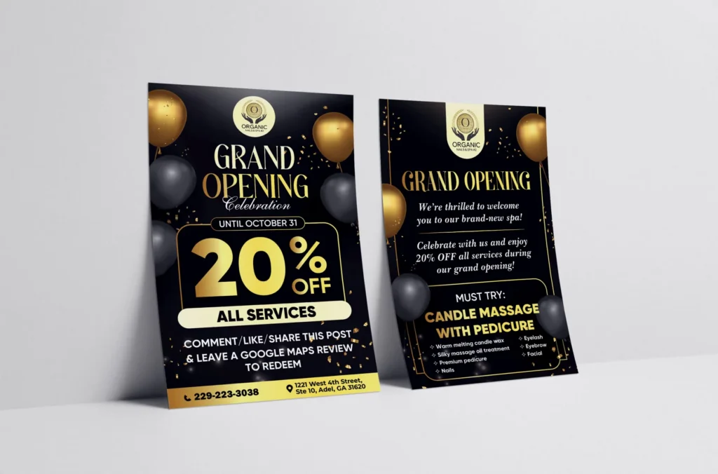
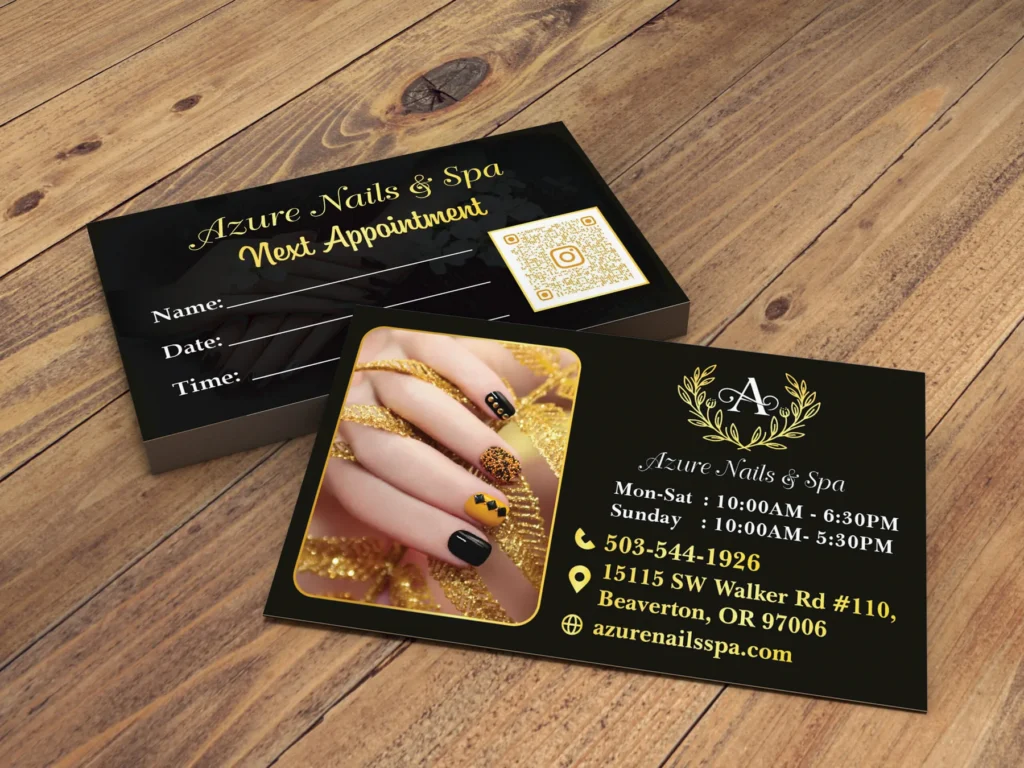
Printing changes how a logo looks. Fine lines can disappear on textured paper; colors look different on uncoated stock; gold foil needs simple shapes; window decals are usually cut from one color. Before finalizing, ask your printer for a proof of a business card and a decal mockup. A logo designed with printing in mind will look right on every material.
Signs and storefronts
A storefront sign is read from a car or across the street. The salon name must be the largest element, with high contrast against the background and no thin details. If your logo has a tagline or a delicate icon, the sign version may use only the name. Check local sign rules before ordering, and see our guide to salon signage ideas for more.
Social media and Google profile images
Profile pictures are shown as small circles. Use the compact icon or monogram, centered with space around it, on a solid background. Test it next to other salons in a Google search on your phone: can a client spot yours instantly? Consistent profile images across Google, Apple Maps, Instagram and Facebook help clients recognize you everywhere.
Beyond the mark: the rest of your brand
A great mark alone does not make a brand. Clients experience your salon through many small details that should feel related:
- Interior colors that echo your brand palette.
- Uniforms or aprons in matching tones.
- Photography style on Instagram and your website: light, backgrounds, mood.
- Tone of voice in captions, emails and signs: warm, playful, refined.
- Packaging: gift certificate envelopes, retail bags, stickers.
When these details line up, clients remember your salon even when the name slips their mind. When they clash, the best design in the world feels disconnected from the real experience.
Naming and visual identity for a second location
If you open a second salon, decide whether it carries the same name and look or becomes a separate brand. Using the same identity builds recognition and lets you reuse every file; a separate brand suits a different concept, such as a luxury spa next to a quick nail bar. Mixing the two, with a slightly different name and a slightly different look, usually confuses clients and search engines alike.
Names in two languages
Many salons are owned by Vietnamese-American families and serve clients who speak English, Spanish or Vietnamese. If your salon uses a Vietnamese word or a family name, check how it reads to English speakers: is it easy to pronounce, spell and search? Diacritics may disappear on some signs and systems, so make sure the name still reads well without them. Some owners choose an English name for the storefront and keep a Vietnamese tagline for community events. Whatever you decide, use the same spelling everywhere, from Google to the window.
Budget and timeline
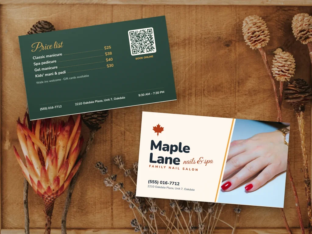
Plan for three parts: concepts and refinements, final files and a brand guide, then the cost of rolling the design out on signs, cards, menus and uniforms. The rollout often costs more than the design itself, so schedule it: digital profiles first, then printed items as old stock runs out, and the storefront sign last if it needs permits. A clear plan avoids months of mixed old and new materials.
Questions to ask a designer
- How many concepts and revision rounds are included?
- Which files and versions will I receive?
- Will I own the final design and its rights?
- Will you check that fonts are licensed for commercial use?
- Can you show the design on a sign, a card and a phone mockup?
- Will you provide a simple brand guide?
Clear answers prevent surprises, especially about ownership and font licenses.
Keep the brand consistent
Once the design is final, protect it. Ask every printer and sign maker to use the original files, never to redraw or "adjust" them. Keep colors consistent by sharing exact color codes. Avoid adding effects such as shadows or outlines that are not in the guide. Consistency is what makes a simple mark feel like a real brand after a year of use.
A launch plan for a new look
- Update Google Business Profile, Apple Maps, Yelp, Facebook and Instagram images the same day.
- Update the website header, favicon and email signatures.
- Order new business cards, gift certificates and menus.
- Schedule window graphics and the sign.
- Announce the new look to clients with a short post: what changed and why.
Clients enjoy a fresh look when it feels intentional and complete.
Mistakes to avoid
- Thin script fonts that disappear at small sizes.
- Too many details in the icon.
- Gradients and effects that print badly.
- Copying another brand's style or name.
- Only a JPG file with no vector version.
- No one-color version for decals and stamps.
How Dreamer helps with nail salon logos
Every Dreamer Social Marketing plan includes a free logo design, created for your salon and delivered with the files you need for print and screens. Our design and printing team then carries the logo onto business cards, menus, gift certificates and window graphics, so everything clients see looks like one brand.
Frequently asked questions
What makes a good nail salon logo?
Simplicity, readability at small sizes, a one-color version, a style that fits your salon and a look that stands apart from competitors.
Should my logo include a nail polish bottle or a hand?
You can, but these images are very common. A symbol tied to your name or story is more memorable.
What colors work best for a nail salon logo?
The colors that match your salon's style and stay readable on light and dark backgrounds. Keep the palette small.
What logo files do I need?
Vector files, transparent PNGs, full-color and one-color versions, a compact icon and the color codes and fonts.
Do I need to trademark my salon logo?
It is worth checking trademark databases before committing, and talking to a trademark attorney about registration for an important brand.
How long does logo design take?
A focused project with a clear brief usually takes a few rounds of concepts and refinements.
Nail salon logo design is about clarity more than decoration. Choose a type that fits your name, a small palette, readable fonts and a symbol that is truly yours, then test it small, check trademarks and get every file you need. A logo built this way will look right on the sign above your door and on the smallest card in a client's wallet.