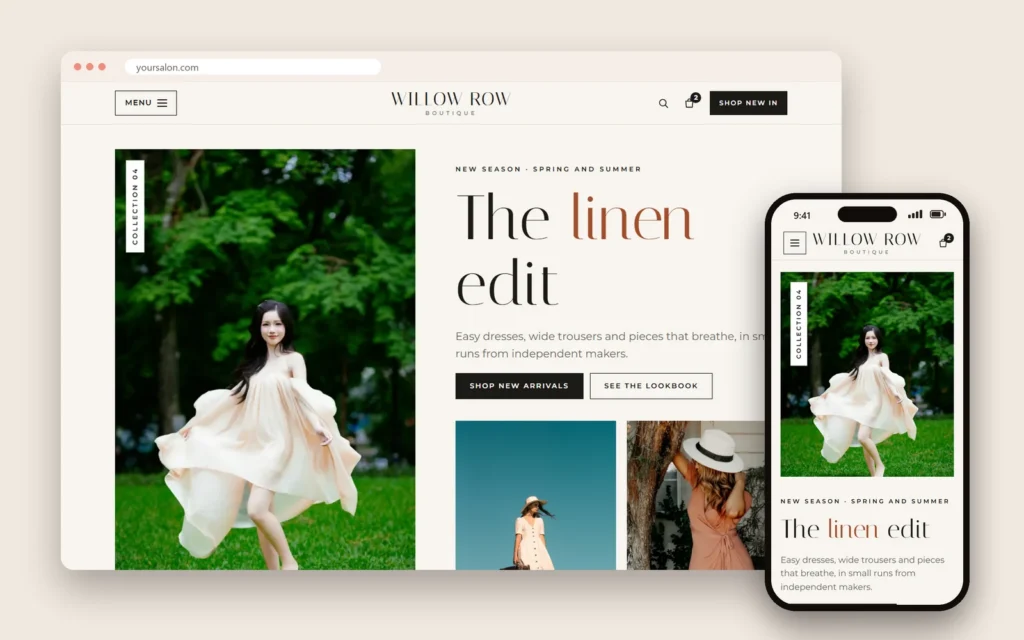
ADA website compliance worries many small business owners after they hear about demand letters sent to salons, restaurants and shops whose websites are hard to use with a screen reader. The worry is understandable, but the goal is bigger than avoiding a letter: an accessible website works for customers who are blind or have low vision, customers who cannot use a mouse, older customers with shaky hands, and anyone reading a menu on a phone in bright sunlight. Accessibility is good business.
This guide explains, in plain language, what the Americans with Disabilities Act and federal guidance say about websites, what the WCAG standard is, fourteen practical fixes most small business sites need, why automated overlay widgets are not a shortcut, and how to test your own site. It is general information, not legal advice; if you receive a demand letter, talk to a lawyer.
In this article
- What the law says, in plain words
- What WCAG is
- Who benefits from an accessible website
- Fourteen practical fixes
- Overlay widgets are not a shortcut
- How to test your website
- Common problems on salon and restaurant sites
- A simple accessibility statement
- Make accessibility part of every update
- Choosing booking, ordering and payment tools
- Salons: services, prices and booking
- Restaurants: menus and ordering
- Shops: product pages
- Train the team to help
- A 30-day accessibility plan
- Accessibility and SEO help each other
- Accessibility and physical access information
- Color, fonts and brand style
- Forms that everyone can complete
- If you receive a demand letter
- Mistakes to avoid
- How Dreamer builds accessible websites
- Frequently asked questions
What the law says, in plain words
The ADA requires businesses open to the public, called public accommodations, to provide equal access to people with disabilities. The U.S. Department of Justice explains in its guidance on web accessibility and the ADA that businesses open to the public must make sure they communicate effectively with people with disabilities, and that this includes their websites. The guidance points to existing technical standards, such as the Web Content Accessibility Guidelines, as helpful guidance for making websites accessible.
For a salon, restaurant or shop, that means customers with disabilities should be able to find your hours, read your menu and prices, book an appointment and contact you, just like everyone else. The practical question is simple: can a customer who cannot see the screen, or cannot use a mouse, do the same things on your site as any other customer? If the answer is yes for the tasks that matter most, you are on the right path; if not, those tasks are where to start.
What WCAG is
The Web Content Accessibility Guidelines (WCAG) are the most widely used technical standard for web accessibility. They are organized around four ideas: content must be perceivable, operable, understandable and robust. Most businesses aim for WCAG level AA, which covers the issues that matter most for everyday users. You do not need to memorize the standard; you need a website built and maintained with it in mind.
Who benefits from an accessible website
- Blind customers who use screen readers that read pages aloud.
- Customers with low vision who zoom in or need strong contrast.
- Customers who cannot use a mouse and navigate with a keyboard or switch device.
- Deaf or hard-of-hearing customers who need captions on videos.
- Customers with cognitive disabilities who benefit from clear, simple layouts.
- Everyone on a small phone, in sunlight, in a hurry or with one hand busy.

Fourteen practical fixes
1. Text descriptions for images
Every meaningful image needs alternative text that describes it: "Gel manicure with milky white tips and silver chrome". Decorative images can be marked so screen readers skip them.
2. Menus and prices as text
A menu posted only as a photo or scanned PDF cannot be read by screen readers. Put menus and price lists on the page as real text.
3. Strong color contrast
Light gray text on a beige background may look elegant but is hard to read. Use enough contrast between text and background, especially for small text and buttons.
4. Readable text sizes
Body text should be comfortable to read on a phone, and the page should still work when a visitor zooms in.
5. Clear headings
Use real headings in order, so screen reader users can jump between sections like "Services", "Prices" and "Hours".
6. Descriptive links and buttons
"Book a gel manicure" or "View our menu" works better than "Click here". Icon-only buttons need a hidden text label.
7. Keyboard access
Everything clickable must work with a keyboard: menus, booking steps, forms and pop-ups. Visitors should see where the keyboard focus is.
8. Accessible forms
Every field needs a visible label, errors need clear explanations, and required fields must be marked in text, not only with color.
9. Accessible booking and checkout
If clients book or buy online, the whole flow must work with a keyboard and screen reader: choosing a service, picking a time, entering details and confirming. Test it, or ask your booking provider about accessibility.
10. Captions and transcripts
Videos with speech need captions. Avoid autoplaying videos with sound.
11. No traps or surprises
Pop-ups must be easy to close with a keyboard, and nothing should flash rapidly. Carousels should be pausable.
12. Consistent navigation
Keep menus and layouts consistent from page to page so visitors learn the site quickly.
13. Language and clear writing
Set the page language correctly, write in plain language and explain abbreviations.
14. Accessibility statement and contact
Add a short accessibility page describing your commitment, and give customers a way to report problems and get help, such as a phone number and email.
Overlay widgets are not a shortcut
Some companies sell plug-ins that promise to make any website compliant automatically. Be careful. In 2025, the FTC approved a final order requiring accessiBe to pay $1 million over claims that its AI-powered tool could make any website compliant with WCAG; the order bars such claims without supporting evidence. Many accessibility professionals and users with disabilities report that overlays can miss real barriers or even create new ones. The reliable path is an accessible website: good structure, real text, labels and testing.
How to test your website
You do not need to be an expert to find common problems:
- Keyboard test: put the mouse away and try to book or contact using only the Tab, Enter and arrow keys.
- Zoom test: zoom to 200% on a computer; nothing should overlap or disappear.
- Phone screen reader: turn on VoiceOver on iPhone or TalkBack on Android and listen to your home page and booking flow.
- Automated checkers: free browser tools flag missing alt text, low contrast and missing labels. They catch many issues but not all.
- Real users: if possible, ask someone who uses assistive technology to try your site.
Common problems on salon and restaurant sites
Some barriers appear again and again on small business websites:
- Price lists as images: beautiful graphics that screen readers cannot read.
- Booking pop-ups that trap the keyboard or cannot be closed.
- Menus as PDFs without real text or structure.
- Thin, light fonts on photos, impossible to read for many visitors.
- Icon-only social and phone buttons with no text labels.
- Hover-only menus that do not open with a keyboard or on touch screens.
- Maps embedded without an address in text, leaving screen reader users without directions.
- Galleries without descriptions, so blind visitors miss what makes your work special.
Fixing these covers a large share of the practical problems customers face.
A simple accessibility statement
A short page shows commitment and gives customers a path to help. For example:
"We want everyone to be able to use our website. We work to follow the Web Content Accessibility Guidelines and test our site regularly. If you have trouble reading a page, booking an appointment or finding information, please call us at the number below or email us, and we will help you right away and fix the problem."
Then make sure someone actually answers those calls and emails.
Make accessibility part of every update
Accessibility is not a one-time project. Each time you add a page, a photo, a menu or a promotion:
- Add alt text to new images.
- Put new menus and prices in text.
- Check contrast on new banners and graphics.
- Test new forms and pop-ups with a keyboard.
- Add captions to new videos.
A two-minute check with each update keeps the site accessible as it grows. Our guide to website maintenance for small business includes accessibility in the monthly routine.
Choosing booking, ordering and payment tools
Third-party tools are part of your website experience. Before choosing a booking system, ordering platform or payment page, ask the vendor:
- Does it work with screen readers and keyboards?
- Does it follow WCAG, and has it been tested?
- How do customers get help if something does not work?
If a tool you depend on has barriers, tell the vendor, offer customers an alternative such as booking by phone, and consider switching if it is not fixed.
Salons: services, prices and booking
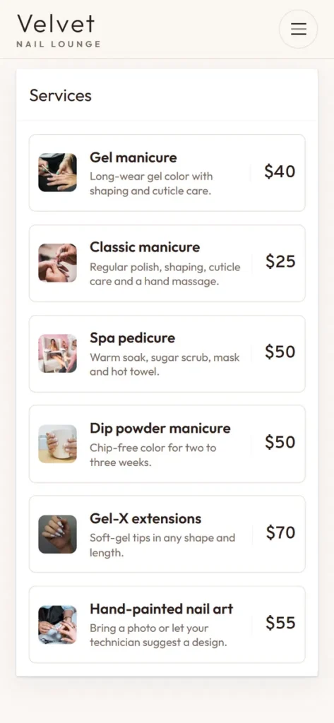
For nail salons, lash studios and spas, accessibility usually starts with three things: a service list in real text with prices and durations, photos described in words, and a booking flow that works with a keyboard and screen reader. Add a phone number and a note such as "Prefer to book by phone? Call us and we'll book for you" next to the booking button, so nobody is left out if a tool fails.
Restaurants: menus and ordering
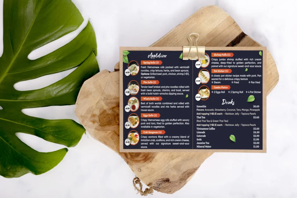
For restaurants, the menu is the heart of accessibility. Put it on the page as text with prices and allergen notes, keep any PDF as an extra, and make online ordering work without a mouse. Describe dishes plainly, explain spice levels and offer a phone number for orders. A customer who cannot read your menu online will simply choose a restaurant whose menu they can read.
Shops: product pages
For boutiques and markets, every product photo needs a short description, sizes and colors must be readable as text, and the cart and checkout must work with keyboards and screen readers. Size guides should be tables of text, not images of tables.
Train the team to help
Staff who answer the phone or messages should know what to do when a customer says the website is hard to use: help them book or order directly, note the problem, and pass it on so it gets fixed. A friendly human response matters as much as the code.
A 30-day accessibility plan
Week 1: run the keyboard, zoom and screen reader tests on your home page, menu or services page and booking or ordering flow; list every problem.
Week 2: fix the biggest barriers: menus as text, alt text, labels on forms, contrast on buttons.
Week 3: fix navigation and pop-ups; add captions to videos; publish an accessibility statement with contact details.
Week 4: retest the same flows, ask someone who uses assistive technology to try them if you can, and set a reminder to check again after every update.
Accessibility and SEO help each other
Many accessibility practices also help search engines understand your site: real text instead of images, clear headings, descriptive links and image descriptions. An accessible website is often a better-ranked website, which is one more reason to build it right from the start.
Accessibility and physical access information
Your website should also describe physical access: step-free entrance, ramps, elevators, accessible restrooms, wide aisles, accessible parking and service animals welcome. Customers with disabilities plan visits based on this information. Be specific and honest; "one small step at the entrance, staff can help" is more useful than a vague "accessible" label.
Color, fonts and brand style
Accessible design does not mean a plain or ugly website. Brand colors can stay; they just need enough contrast where text sits on them. Use your brand color for large headings, backgrounds and accents, and keep body text dark on a light background or light on a dark one. Choose fonts with clear letter shapes, avoid very thin weights for paragraphs, and keep line lengths comfortable. Many beautiful websites are also highly readable; elegance and clarity work together when they are planned from the start.
Forms that everyone can complete
Contact, booking and order forms are where many customers give up. Keep them short, put labels above fields, explain what format you need ("Phone, for example 555-0123"), show errors in words next to the field, and do not clear everything the customer typed when one field is wrong. Avoid image-based puzzles that are hard for many users; simpler spam protection methods work for most small businesses.
If you receive a demand letter
Do not ignore it. Contact a lawyer experienced with ADA website claims, preserve records, and begin fixing real barriers right away. Fixing the website helps your customers and can strengthen your position.
Mistakes to avoid
- Menus as images only.
- Low contrast text chosen for style.
- Booking widgets nobody tested with a keyboard.
- Relying on an overlay instead of fixing the site.
- Videos without captions.
- No way for customers to report problems.
How Dreamer builds accessible websites
Dreamer's website design service builds salon, restaurant and shop websites with real text menus, readable type and contrast, labeled forms and keyboard-friendly navigation, so more customers can use them comfortably. A showcase website starts at $200 for the first year, including domain and hosting. We also review existing sites and fix common barriers.
Frequently asked questions
Does the ADA apply to small business websites?
The DOJ's guidance says businesses open to the public must communicate effectively with people with disabilities, including on their websites. Small salons, restaurants and shops should treat accessibility as part of serving all customers.
What standard should my website follow?
WCAG is the most widely used standard; many businesses aim for level AA.
Can an accessibility widget make my site compliant?
Do not rely on one. The FTC has acted against misleading claims that an automated tool could make any website compliant. Fix the site itself.
What are the most common problems on small business sites?
Images without alt text, menus as images, low contrast, unlabeled forms and booking flows that do not work with a keyboard.
How often should I check accessibility?
Whenever you change the site, and at least a few times a year.
Is accessibility only about people with disabilities?
It helps everyone: older customers, people on phones in sunlight and anyone in a hurry.
ADA website compliance is less about fear and more about welcome. Put menus and prices in real text, describe images, use strong contrast, label forms, make booking work with a keyboard, caption videos and give customers a way to ask for help. Do that, test regularly and avoid magic shortcuts, and your website will serve every customer who wants to visit.